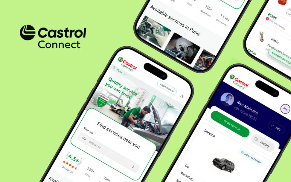
Designing a trustworthy car servicing platform for India
Castrol Connect set out to bridge the gap between Castrol’s strong brand in automotive lubricants and its low visibility as a digital car servicing platform, enabling users to discover, compare, and book services across a fragmented network of workshops.
Problem statement
The challenge extended beyond building a booking flow. Users struggled to understand what the product was, trust unfamiliar workshops, and navigate complex service decisions. Meanwhile, the business prioritised early lead capture and rapid network expansion over clarity and user control.
This created a fundamental design problem:
How might we design a trustworthy, end-to-end car servicing experience that balances user clarity and confidence with operational and business constraints across consumers, workshops, and Castrol operations?
My Role & Ownership
Role: Lead Product Designer
Platform: Web & Mobile
Team: Cross-functional – Product, Engineering (UK, India), QA, Business stakeholders
Tools: Figma, Mural/FigJam, Azure, Microsoft Copilot
I joined Castrol Connect as the Lead Product Designer, initially responsible for enabling a rapid MVP launch and later evolving the product into a scalable, strategy-driven platform. I owned end-to-end design across web and mobile — from research and information architecture through interaction design, design system, and post-launch measurement.
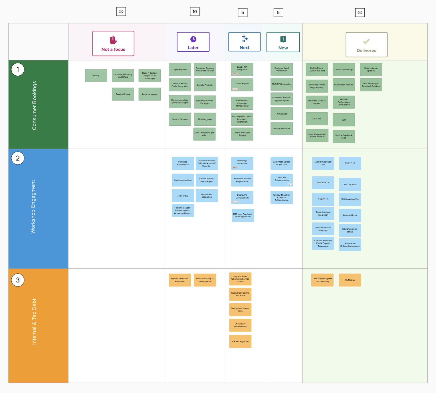
How my role evolved across three phases
Phase 1: MVP Launch (Execution under constraint)
The initial brief was to ship fast for the Indian market using an existing global codebase. My focus was adapting the experience to Indian user needs, ensuring the end-to-end booking journey worked functionally, and collaborating tightly with engineering to hit the launch date. I was execution-heavy here, shaping decisions in real time within hard technical constraints.
Phase 2: Post-MVP (Validation & Gap diagnosis)
Once the product was live and showing early traction, I initiated a structured research programme to identify core experience gaps. I ran 8-10 discovery interviews and usability sessions across both consumer and workshop sides, an effort I planned, moderated, and synthesised myself. This phase shifted my role from delivery to diagnosis.
Phase 3: Strategic Design (Ownership & Direction)
I took full ownership of UX strategy, product direction, and the experience roadmap. I defined the design principles that guided every subsequent decision, established analytics instrumentation to track 15+ experience quality metrics post-launch, and aligned design decisions directly to business OKRs in stakeholder reviews.
Discovery
What I set out to learn
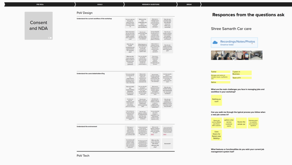
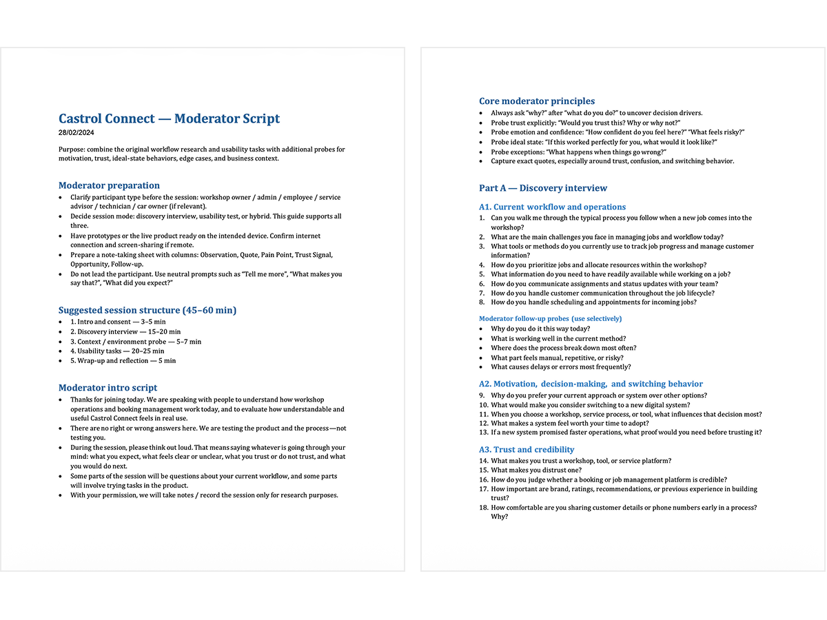
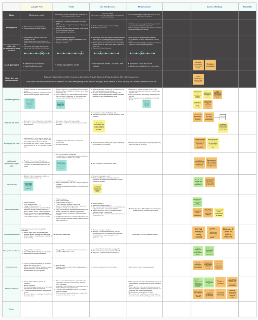
I ran 8–10 research sessions combining discovery interviews and usability testing, using a think-aloud protocol to capture real-time reactions across two key task flows:
- Consumer flow: Discover → Compare → Book
- Workshop flow: Create jobs → Manage schedule → Communicate updates
My participant criteria: consumers with low awareness of Castrol Connect, and workshops operating with partially digital, highly manual systems.

What I found
Both customers and workshops relied on existing trust-based, informal systems, making adoption a trust and behaviour change problem, not just a usability problem.
On the consumer side:
- Decisions were driven by trust, proximity, and past experience — not platform features
- Users consistently struggled to understand what Castrol Connect actually offered
- Early requests for personal data (phone number before value was established) caused drop-off
- Unfamiliar workshops without clear credibility signals created hesitation at the selection step
On the workshop side:
- Operations were reactive and fragmented — coordinated through calls, WhatsApp, and memory
- Workshops had limited visibility into jobs and schedules
- Several workshop owners said they didn’t understand what the platform was supposed to do for them
User voice (selected quotes from sessions):
I’ll just go to my regular workshop — I trust them more.
Why are you asking for my phone number already?
We already manage everything through calls and WhatsApp.
I don’t know what Castrol Connect is supposed to do.
The root cause
Users didn’t drop off because the product was hard to use. They dropped off because clarity and trust were missing from the start. Three distinct barriers emerged:
| Barrier | Where it hit | What it caused |
|---|---|---|
| Clarity | Entry | Users didn’t know what the product was, most left before exploring |
| Trust | Selection | Weak workshop credibility + premature data capture reduced confidence |
| Decision complexity | Comparison | Users defaulted to cheapest or most familiar option rather than best fit |
Design Direction
I reframed the design challenge: the opportunity was not to add features, but to make the experience understandable, trustworthy, and easy to act on.
Three principles shaped every decision from this point:
- Make purpose obvious before asking for anything. Communicate value early and explicitly.
- Earn commitment progressively. Let users explore before they commit data or money.
- Reduce cognitive load at the decision point. Fewer, clearer signals beat more information.
Key Design Decisions
Decision 1 — Redesigning the entry experience for clarity
The problem: Users interpreted the homepage as generic Castrol brand content, not a service platform. Most dropped off without understanding what action to take.
What I changed: I reworked the entry flow to lead with a clear value proposition and a single, direct call to action. I replaced category-led navigation (which assumed users already knew what they wanted) with a need-led entry point (“What do you need done today?”).
My process: I tested three entry concepts with 5 users using low-fidelity prototypes in Figma. The need-led version consistently produced faster comprehension and higher intent to continue.
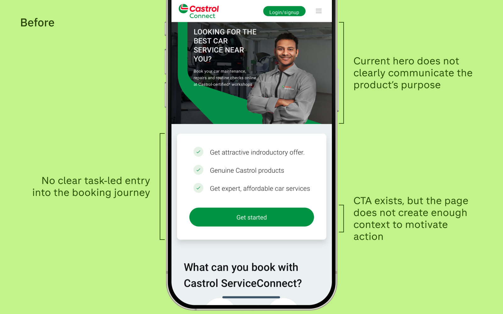
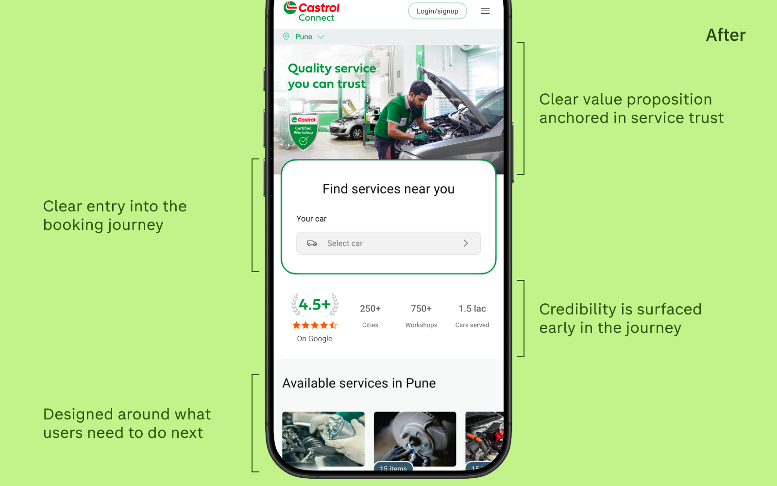
Impact: Users could orient themselves faster and were significantly more likely to proceed past the entry screen into the booking flow.
Decision 2 — Reducing early friction while preserving lead capture
The problem: User interviews showed that OTP and phone-number capture created friction early in the journey. Users were being asked to verify themselves before they had enough context to understand the service, evaluate options, or feel motivated to continue. This often triggered a “why do they need this already?” reaction and weakened progression.
At the same time, marketing and business teams were strongly focused on capturing leads early so those users could be followed up offline. This meant the challenge was not to remove lead capture, but to reduce the friction it created.
What I changed: Instead of removing OTP or lead capture, I redesigned the early journey to make it more guided, relevant, and easier to complete. The original experience pushed users too quickly into a higher-effort interaction. The redesigned flow broke that experience into smaller, progressive steps, such as identifying the car, capturing location before asking for identity confirmation.
This shifted the interaction from a high-cognitive-load form into a lighter progressive flow that better matched how users build intent. It also allowed the business requirement for lead capture to remain in place without making the start of the journey feel abrupt.
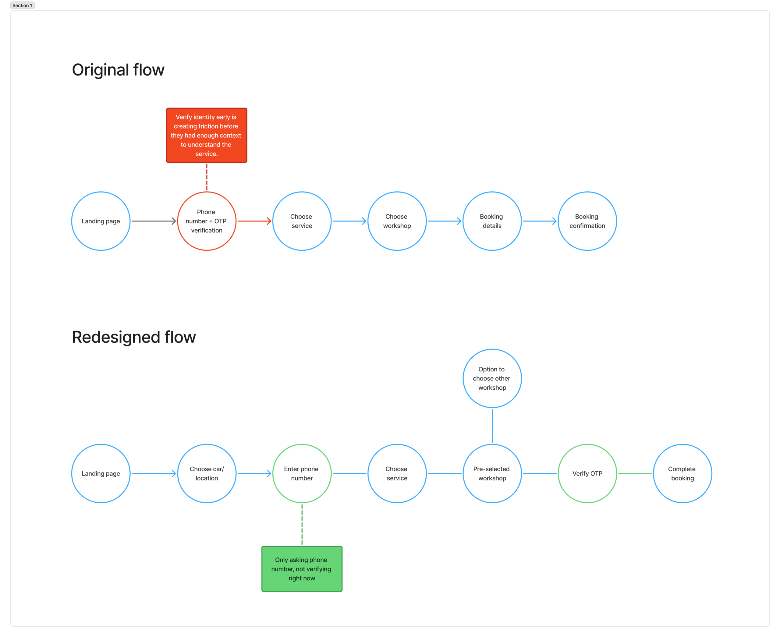
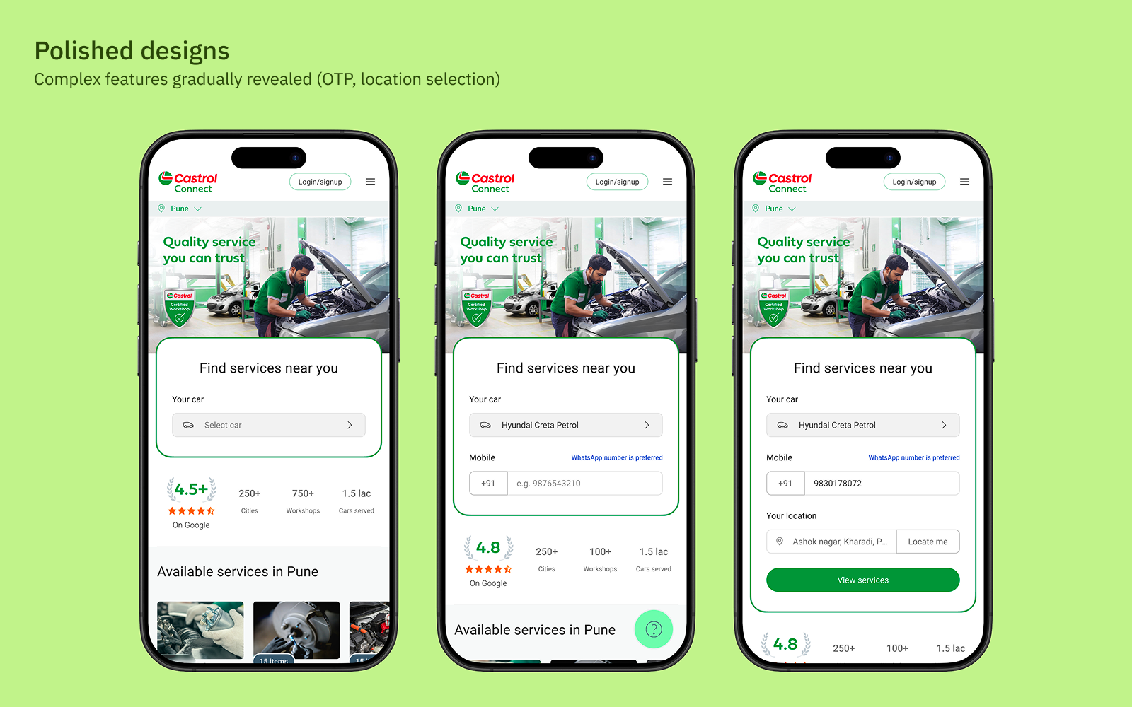
Impact: The redesigned flow reduced early friction while preserving lead capture. By helping users build relevance and momentum first, the OTP step felt more natural when it appeared. Users were able to progress further into the journey before being asked to verify themselves, which created a smoother and more intentional path toward conversion.
Decision 3 — Strengthening workshop credibility signals
The problem: Workshop listings showed a name, location, and specilizations. Users had no basis for trusting an unfamiliar workshop — especially when comparing against a mechanic they’d used for years.
What I changed: I redesigned workshop profiles to surface structured credibility indicators — clear trust badge, customer ratings.
My process: I ran a competitive analysis across 5 enterprise and consumer service platforms (including GoMechanic, and Bosch Car Service) to understand what trust signals were industry standard and where we could go further.
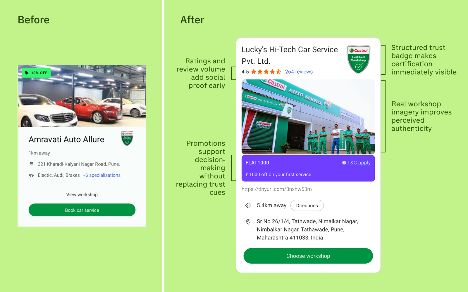
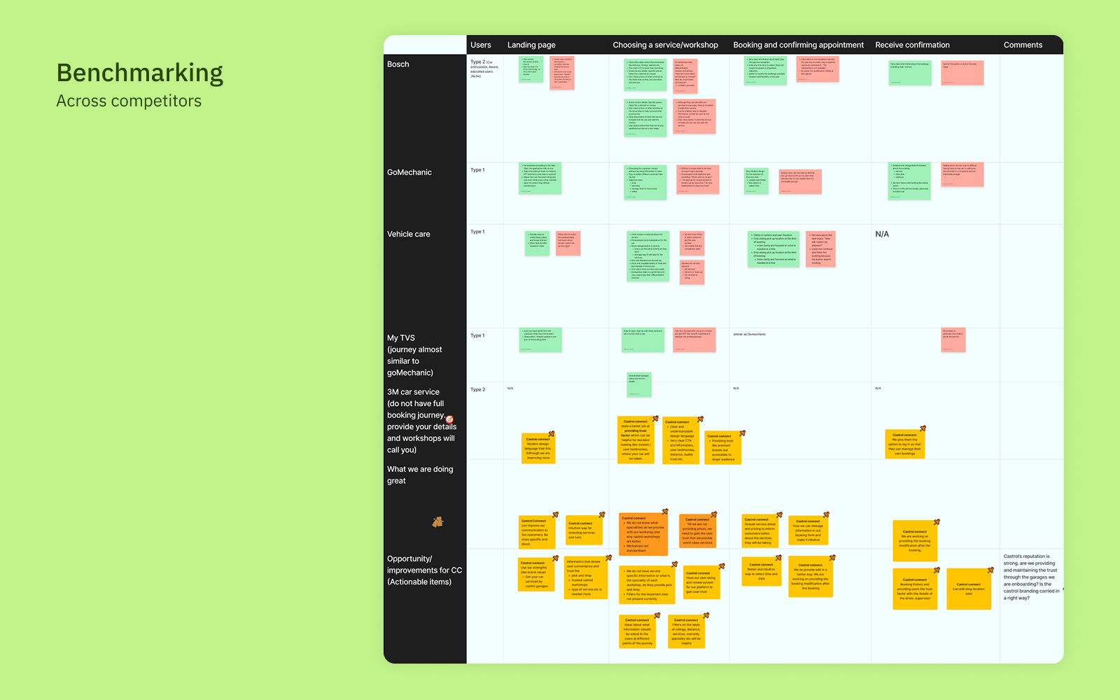
Impact: Users spent more time evaluating workshops rather than defaulting immediately to the closest option or abandoning the comparison step.
Decision 4 — Simplifying service comparison to reduce cognitive overload
The problem: Service package pages presented long lists of line items with minimal visual differentiation. Users couldn’t identify what actually differed between packages, so they chose on price alone or dropped off entirely.
What I changed: I restructured service packages around the user’s key decision questions: “What’s included? What’s the difference? Is this right for my car?” I introduced a comparison-first layout with progressive disclosure for detail, and used iconography to make category differences scannable.
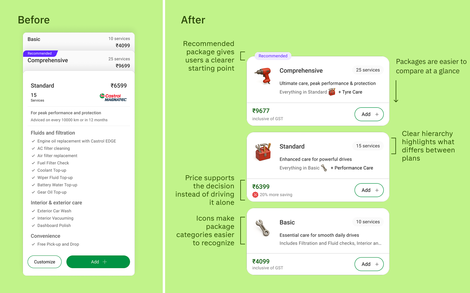
Impact: Users made quicker, more confident service decisions and relied less on price as the default selection criterion.
Design System & Product Kit
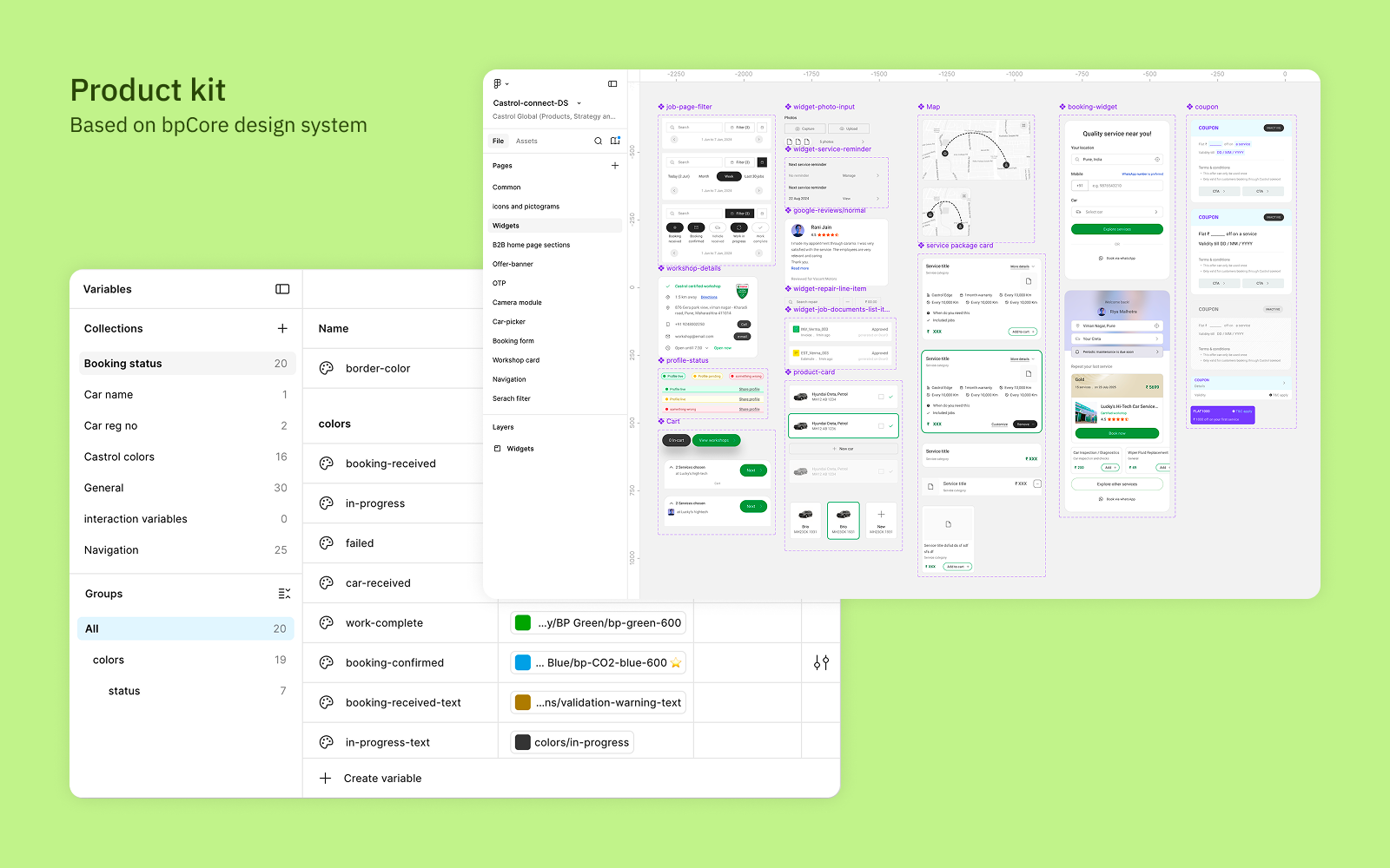
Building on bp’s global design foundation, I created a Castrol Connect product kit — a set of product-specific components, tokens, and patterns layered on top of bp’s enterprise design system.
Why this needed to exist: bp’s global system covered brand fundamentals — colour, typography, grid — but it wasn’t built for a consumer-facing transactional product. CastrolConnect had unique needs: a multi-step booking flow with complex states, workshop profile cards, service comparison patterns, and trust signal components. None of these existed in the global library.
What I built
- 60+ components covering the full booking journey — entry cards, workshop profiles, service comparison modules, booking confirmation states, error handling, and empty states
- Trust signal components — verified badge, rating display, response time indicator — designed as reusable atoms so they apply consistently across all consumer-facing surfaces
- Accessibility annotations — every component documented with WCAG 2.1 AA contrast ratios, touch target sizes (minimum 44×44px), and screen reader behaviour notes
- Tokenised colour layer — Castrol-specific colour aliases mapped over bp brand tokens, so any brand-level theming update propagates instantly without manual rework
Impact on delivery
The product kit reduced design-to-development handoff friction measurably. Developers referenced component specs directly in Figma rather than interpreting screens; QA used the same component documentation to define acceptance criteria. This standardisation, combined with AI-assisted prototyping workflows, contributed to the ~40% reduction in iteration time I measured across three product squads in Phase 3.
Solution
The redesigned experience shifts Castrol Connect from a feature-led booking flow to a trust-driven customer journey — built around three shifts:
Confident decision-making — workshop credibility and service comparison designed to reduce uncertainty, not increase choice
Clarity at entry — users understand what the platform offers before they’re asked to do anything
Progressive commitment — data capture aligned to booking intent, not lead harvesting
Outcomes
“How might we design a trustworthy, end-to-end car servicing experience that balances user clarity and confidence with operational and business constraints across multiple stakeholders?”
We did. The redesign delivered measurable results across both the user experience and the business:
- +36% increase in user engagement post-redesign — the primary platform health metric tracked by the bp product team
- 15+ experience quality metrics established and tracked post-launch, giving the product team a continuous feedback loop for iteration for the first time
- Reduced drop-off at early funnel steps following the delayed data capture change — users who saw the workshop selection step showed significantly higher booking intent
- Faster prototype-to-handoff cycles — by embedding AI-assisted design tools (Microsoft Copilot, Figma Make), I reduced iteration time by approximately 40% across the delivery team, enabling more research cycles within the same sprint cadence
- Competitive analysis of 5 enterprise service platforms informed the IA and workshop credibility framework — giving design decisions an evidence base beyond internal assumptions
36%
Engagement uplift
15+
Metrics tracked
40%
Faster iteration
Validation & Iteration
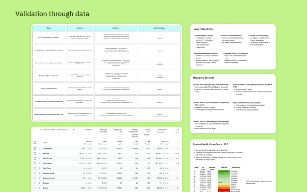
Post-redesign testing confirmed that usability improvements helped users move through the flow more smoothly — but did not fully resolve the deeper trust barriers around the product itself. Users were better able to follow the journey; many still evaluated Castrol Connect against authorised service centres, known mechanics, and existing habits.
What testing confirmed most clearly:
- Understanding improved — users could orient themselves more easily and articulate what the platform offered
- Progression improved — reduced friction helped users continue further into the booking flow
- Trust remained the deepest barrier — especially when users compared the platform against familiar offline alternatives
This shifted iteration away from polishing screens and toward strengthening credibility signals, reducing uncertainty, and improving the broader product story — work that extended beyond the UX layer.
Reflection & Strategic Learnings
The CastrolConnect project reframed how I think about design’s role in a complex product system.
What I learned
Trust is a system property, not a screen property. Even when usability improved significantly, users still hesitated if workshop credibility, product clarity, and business messaging were weak. Interface quality alone cannot substitute for a coherent product story.
Business constraints are design inputs, not obstacles. The decision to delay data capture against product’s preference for early lead capture was the highest-impact single change on this project and it required making the business case in business terms. Design influence grows when you speak the language of conversion, not just craft.
Instrumentation is part of the design. Setting up 15+ post-launch metrics wasn’t an engineering task I handed off, it was a design decision about what to measure and why. The ability to show quantified outcomes in the next stakeholder review changed how the team engaged with design recommendations.
What I’d do differently: I would push earlier for a clearer product positioning strategy. Many of the UX problems, especially at the entry point were downstream effects of a weak product narrative. Getting alignment on “what is Castrol Connect for, exactly?” before designing the booking flow would have compressed the Phase 2 diagnosis considerably.